Attracting a potential visitor to your site is only the first step. Grabbing their interest and retaining them is even more difficult.
Customer retention is incredibly important for growing a sustainable business, so it’s very important to design your website in such a way that your user frustration is minimum.
Top 8 Reasons that Makes someone leave a Website
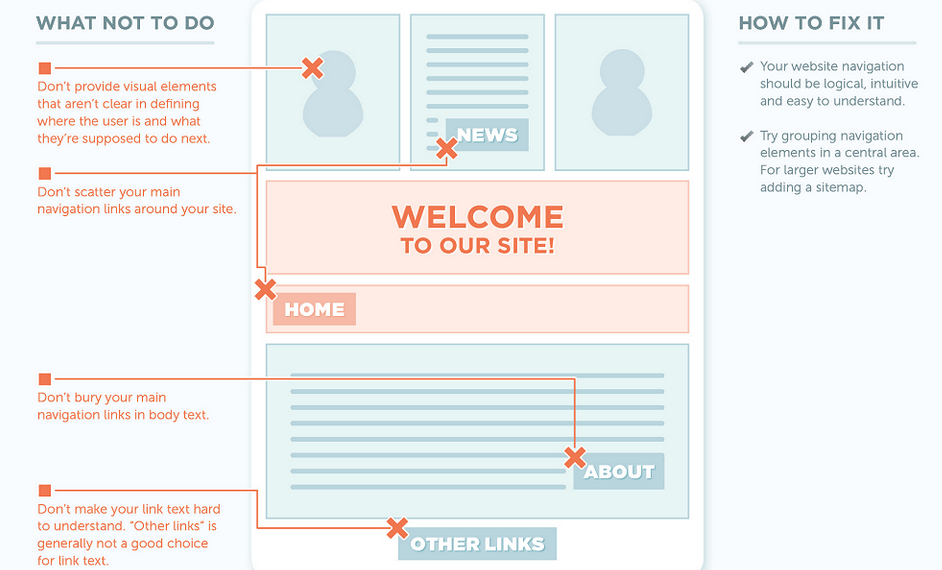
1) Bad Navigation – Nothing frustrates a website visitor more than a website that’s hard to navigate. Complex or inconsistent navigation can cause users to feel helpless, confused, or angry – certainly not the emotions you want potential customers to be feeling.
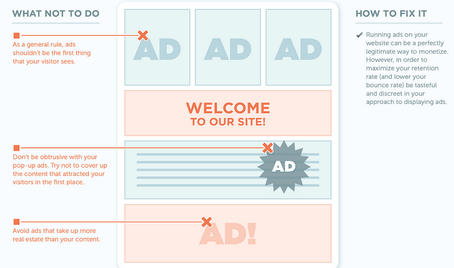
2) Too Many Ads – Suffocating your visitor with ads that pop, flash, and fill the entire browser will only serve to enrage them.
3) Bad Content Structure – Bad content can destroy your conversion and retention rates. Make your content(especially your contact info) easy to find. It’s estimated that as many as 50% of sales are lost bacause potential customers can’t find what they’re looking for.

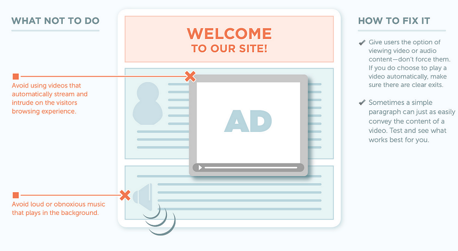
4) Obtrusive use of Audio & Video – Most people value their ability to choose what to absorb. Having video or audio that loads automatically can potentially drive visitors away.
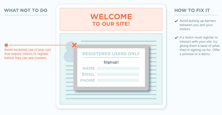
5) The Registration Requirement – it’s often the case that forcing visitors to register before they can view content is much like a physical barrier. Barriers, such as forced-registration, may ultimately cause the visitor to go elsewhere for what they’re looking for.
6) Boring Content, Boring Design – A dull website that has no purpose or interactivity will never create a memorable experience for a visitor. Data suggests that 40% of visitors don’t return to a website after having a negative experience.

7) Poor Legibility – Bad typography choices, abrasive colors, and experience typos all contribute to poor legibilty – and ultimately poor user experience.

8) Lack of Frequency – You may have found the right balance of interactivity, design and content construction – those are all good things. But you also need to keep your site fresh with new content.

- Maximize Leads for Your Amazon Repricer SaaS Tool with These Bottom-Funnel Keywords - October 2, 2024
- Boost Your Tool Signups with Low-Funnel Keywords: A Guide for Keyword Research Tool Owners - October 1, 2024
- Event Management Software: Lower-Funnel Keywords to Boost Leads for Your SaaS - September 28, 2024
- Maximize Your Webinar SaaS Leads: Top Keywords to Target Now - September 27, 2024
- Top 10 Ecommerce SEO Companies (Exclusive List) - July 22, 2024
- Top 10 White Label SEO Agencies (Well-Researched List) - July 20, 2024
- How-To Do SEO for Ecommerce Website (Everything You Need is Here) - July 6, 2024
- Top 10 Shopify SEO Agencies (Exclusive List) - June 28, 2024
- Top 10 Ecommerce Marketing Agencies - June 9, 2022
- Top 10 SEO Companies in India – Best SEO Company India for Affordable SEO Services - June 1, 2022
